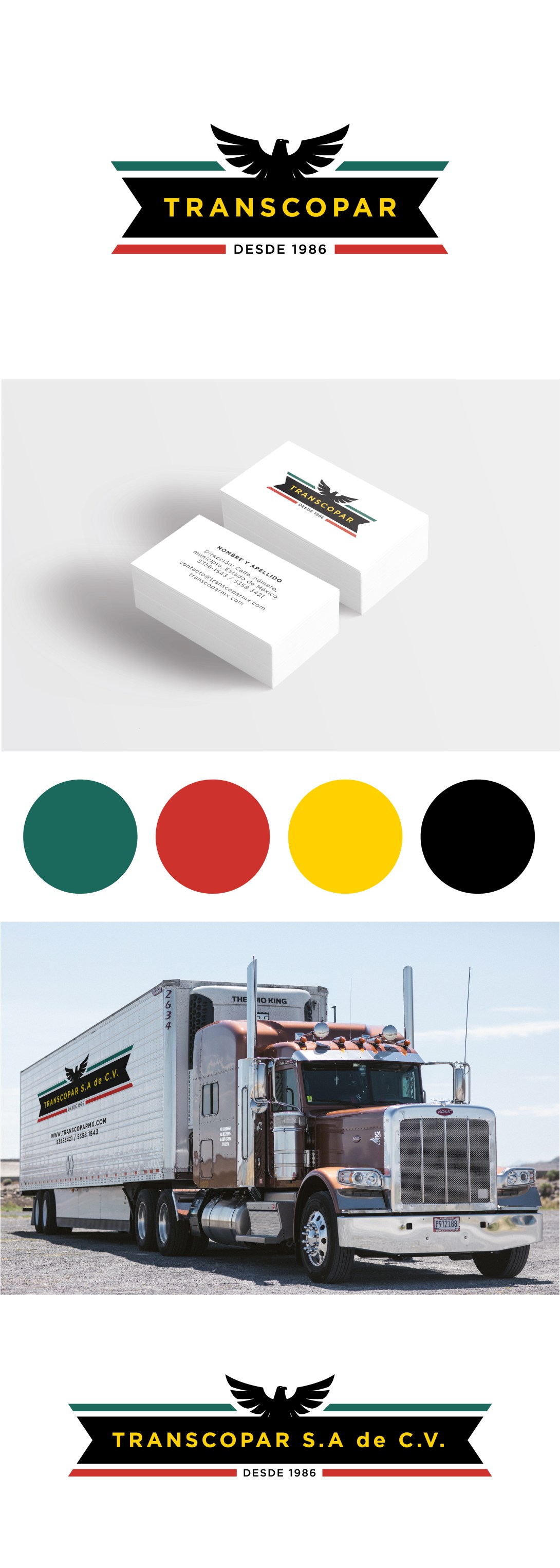
Ahora tocó hacerle el rediseño a Transcopar, una empresa de transporte de mercancías. Aquí el reto fue que necesitábamos que se viera más profesional, pero manteniendo la idea original con el águila y los colores. Entonces tomamos lo que ya existía y lo mejoramos, proponiendo una variación de su paleta de color y adecuando el logotipo. Bien precioso que quedó. Chequen también su página aquí (esta fue en colaboración con Estudio BuenaSuerte).
—
Now it was Transcopar’s turn to get a makeover! Transcopar is a merchandize transportation company that needed to keep the basic idea of their identity but make it look more professional. So we took what was already there and improved it, with a twist on the color palette and the other elements. This was the final result. You can visit their website here (this was made in collaboration with Estudio BuenaSuerte).
